


The full review by David Heymann of the MFAH plans to expand, from which this excerpt is drawn, includes a description of Holl’s master plan and his design for the Glassell School. It will appear in the next Cite, a special issue on museums with contributions by Walter Hood, Christopher Hawthorne, and Ronnie Self as well as interviews with Steven Holl, Gary Tinterow, Johnston MarkLee, Josef Helfenstein, Linda Shearer, and others. Subscribe here or call 713 348 4876.
Steven Holl’s promising design development proposal for the Museum of Fine Arts, Houston’s new Nancy and Rich Kinder Building is both ambitious and reasonable. Holl’s site plan, which includes a new Glassell School of Art enfronting a large open plaza, brings legibility and continuity to the museum campus. His design for the Kinder Building maximizes gallery space on a difficult, triangular site, and holds the center by strength of presence. By irregularly slicing its upper edges with the curving offset planes of its roof, Holl has worked to make the building’s substantial mass hard to perceive precisely. Clad in backlit half circular tubes of fritted glass that add further ambiguity, the new Kinder Building will shimmer, organizing urban space in the way a vase can give order to a slightly disorganized room.
Though the glowing facade of the Kinder Building is like that of the Nelson-Atkins Museum of Art in Kansas City, also designed by Holl, the design is more reminiscent of Hans Scharoun’s extraordinary, idiosyncratic Berlin Philharmonie – another opaque, scooped mass shining against a great, dark Mies museum. Like that pairing in Berlin, the organic functionalism of Holl’s Kinder Building establishes a handsome debate with the rationalism of Mies’ great Brown Pavilion. I think as master planning and architecture, it is going to work well. So — breathe a sigh of relief — let’s get to the details of the Kinder Building.
 Beck and Law Buildings. Photo courtesy of MFAH.
Several characteristics define the extraordinary Fayez S. Sarofim Campus of The Museum of Fine Arts, Houston (MFAH). Because its growth has been controlled by random availability of property, the MFAH ensemble consists of singular buildings on roughly adjacent blocks, not bound together by a defined campus boundary, or by conventional spatial mechanisms like axis, symmetry, or syntax. Despite substantial individual differences, the MFAH buildings share a recognizable striving presence. We understand them collectively because, like a loosely organized group of well-dressed politicians canvasing for votes in some central city neighborhood, they are more alike than they are like anything around them. (And, like politicians, each has been considered from every angle to not offend; remarkably, none has a true backside, a phenomenon Holl’s Kinder Building continues through clever handling of the loading dock.)
Most of the MFAH’s major buildings have been designed by strong architects relatively late in their careers, when accomplishment and certainty allow these architects to ease up on the notion that each design commission has to prove everything. The MFAH buildings are simple rather than complex, refined rather than rough, serious rather than exuberant, bespoke rather than experimental, restrained rather than complicated, and remarkably confident rather than brittle. The major buildings sustain a comfortable dialogue perhaps best described as grunting admiration between viable, mature alternatives. The exception is the existing Glassell School, which, despite success as an educational facility, is diagrammatic and tinny as urban architecture, its glass blocks yearning to be recognized for their Modernist props.
Collectively the MFAH buildings form a genus into which the new Kinder Building fits easily: block-like, complete, inscrutable, heavy, and discrete on the exterior; generous, regular (lacking idiosyncrasy), proper, stately, flowing, and calm on the interior. This consistency suggests the MFAH chooses architects heading in that design direction already, or it cleverly herds them that way. The one non-building construction on the campus – the Cullen Sculpture Garden designed by the un-herd-able Isamu Noguchi – does not share these qualities. In the experience of the site, it has always seemed odd and cranky, its excellence notwithstanding. It is closer in spirit to Gunnar Berkerts’ adjacent Contemporary Arts Museum, which, forty-plus years old, feels younger than all the MFAH buildings that postdate it.
 View of the Nancy and Rich Kinder Building entrance looking north on Main Street.
The new Kinder Building will be built on what has always been the logical place for the MFAH to expand: the parking lot next to the Noguchi garden on the north side of Bissonnet, directly across from Mies’ curving Brown Pavilion of the Caroline Weiss Law Building. Long the parking lot for the adjacent First Presbyterian Church of Houston, this open parcel is an inadvertent, ill-defined hole in the center of the campus. In 2007 the MFAH was able to obtain the land from the church — it continues to serve as a shared parking lot. In 2008 it set about establishing a short list of architects to design a new building in which the MFAH could finally bring together its twentieth and twenty-first century holdings — the art that tracks the rise and apotheosis of Modernism and its complex fallouts. (The new building is not designed for major traveling exhibitions, which will mostly continue to go to Brown.) In 2012, three firms — Steven Holl, Snøhetta, and Morphosis — presented conceptual site plans and proposals for the architecture of the new building. Holl was hired to proceed.
...
That his master-plan proposal [described in the the full article from which this review is excerpted] increases the legibility and cohesion of the MFAH campus was likely not the only reason Holl was commissioned for the Kinder Building. There are at least two other good ones. The first is the way-finding clarity Holl often strives for in his plan making. The new Kinder Building is a three-story block (set over two floors of underground parking) organized about a central skylit entry and circulation court. This court is linked to both the Glassell and Law buildings by tunnels. (The tunnel to Law comes in where the Turrell tunnel links to Beck.)
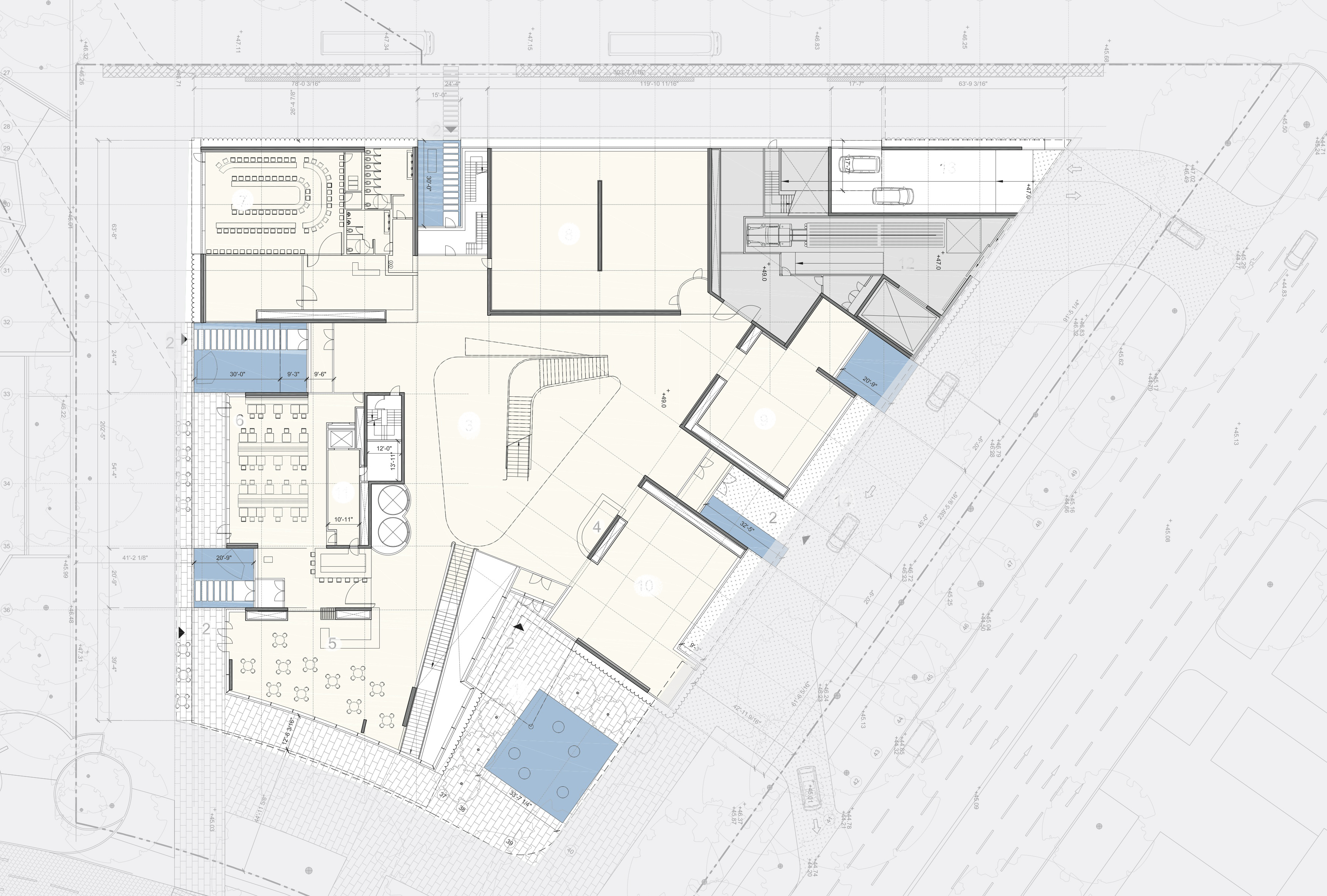 Kinder Building first floor plan. Image courtesy MFAH.
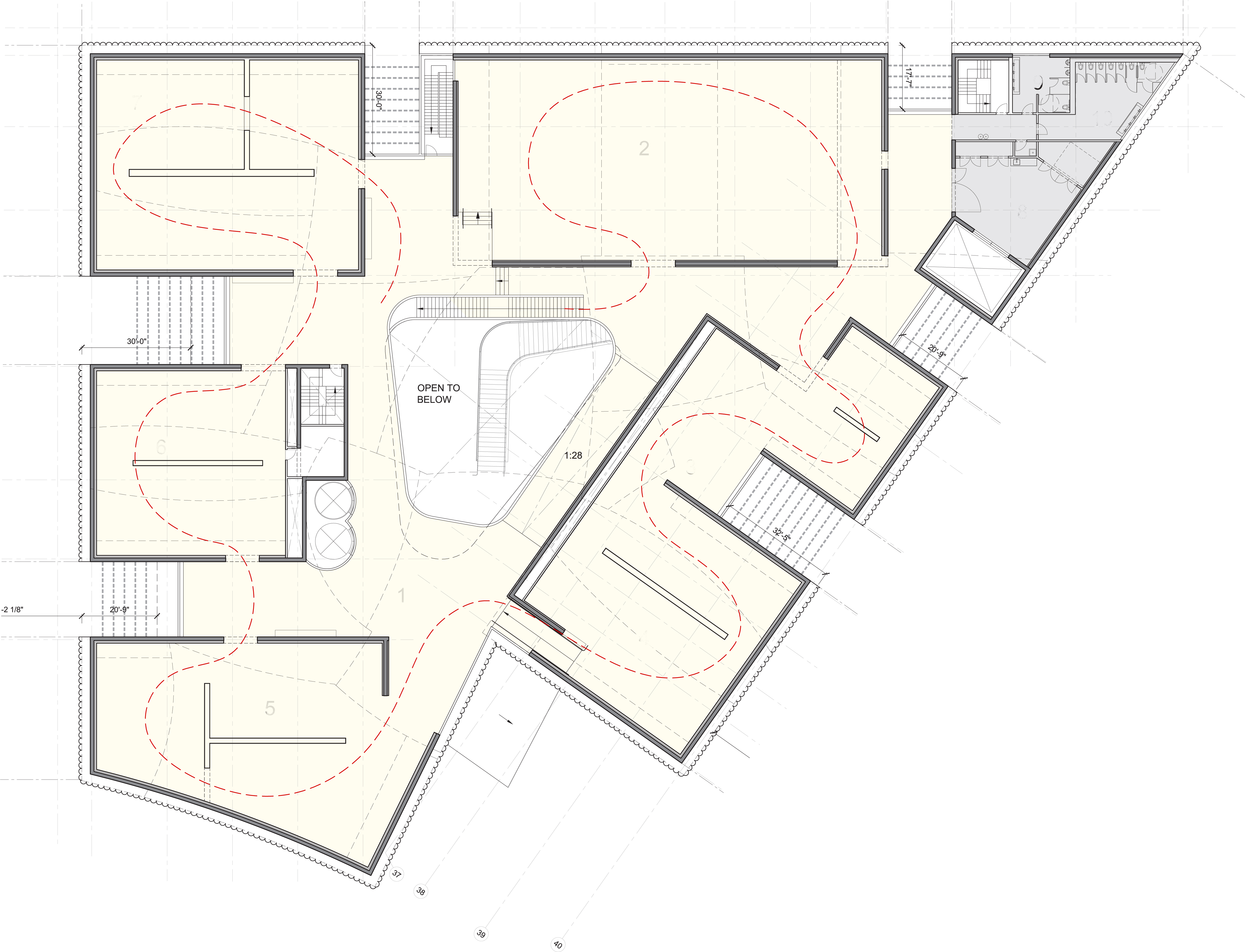 Kinder Building third floor plan. Image courtesy MFAH.
Holl imparts a simple logic to the complex truncated triangular shape of the building mass given to the Kinder Building by the site. Into each of its three long sides he cuts two, small, three-sided, open, vertical, transparently glazed courtyards at regular intervals. Into the southeast corner of the short truncated side — the public corner facing Mies and Moneo — he cuts a larger vertical court. These courts crucially break down the scale of the exterior mass, which is roughly as big as either the Law or Beck buildings. On the interior of the ground floor the courtyards establish the various points of entry, and the dimension of the various programs. On the upper floors the courtyard cuts determine the length of the largely opaque gallery blocks, and set up the rhythm of the experience: art, relief, art, relief.
In Holl’s design the Kinder Building’s ground floor is largely open through transparent glazing to adjacent outside spaces and connecting views. It is mostly given over to present conventions of art museum as social entity: entry, circulation court, café, restaurant, conference center, store. But there is still space for three galleries, beginning the circling exhibition sequence around the open, vaguely ovoid central court and its elegant, ribboning stair. The upper two floors are each a ring of regular gallery boxes around this court. These boxes are simple, individual blocks of space defined with opaque concrete walls — though the interior finish is not yet determined. Each is further subdivided within into simple configurations of rooms by what one assumes are mostly alterable sub-walls. The layout in plan seems direct, flexible, and legible to the visitor.
 The Nancy and Rich Kinder Building entrance lobby. Image courtesy MFAH.
It is the outside walls of these gallery blocks that are clad with the custom-fabricated half round glass tubes. The drawings show occasional voids in these exterior concrete walls where one hopes a distorted, liquid natural light will enter through those tubes. The uppermost of the gallery floors and the central court also take in natural light from slit windows in the building’s roof, which is composed of adjacent, irregular curving planes. In the not yet fully developed building sections — it’s not clear how artificial light will work, nor how glare will be controlled — light enters in the gaps formed between the offset curves of these planes, somewhat like an upside down version of the roof of Holl’s Stretto House in Dallas. Holl’s sketches explain the roof panel shapes as derived from “clouds.” The analogy is a useless stretch, and not really because Holl’s “clouds” are spherical, but because Holl has long and far more convincingly argued for the primacy of sensory experience over symbol or sign in the understanding of architectural meaning. The term here is used to convince by sleight of hand — hard to disagree with clouds! — so I’m trying to avoid using it.
Given the difficulty of the geometry of the buildable site, Holl manages to wring a tremendous percentage of the volume back for exhibition with remarkably little support space in the plans. In the current plans he avoids tactics (often arising to recognize site circumstance) that occasionally make his plans mannered, picturesque, or inflexible. Instead he seems to have focused on sequence and adjacency, on how one simple space leads or connects to the next. This can be beautifully seen in the views to and from the ground floor and the adjacent Noguchi garden, which in the renderings now seems meaningfully connected rather than broodingly hermetic.
 Kinder Building roof plan. Image courtesy MFAH.
It isn’t clear yet how the plan will accommodate darkness (for the exhibition of drawings, photographs, electronic media, etc.). And the relative scale of exhibition spaces seems remarkably consistent — the source of some difficulties with Breuer’s great Whitney Museum building. This consistency is alleviated somewhat by a slight ramping of the floor plate on each upper level. The gallery boxes will thus vary somewhat in height; the occasional steps and ramps add, I think, a slight but necessary grace to the circulation sequence. Overall the plan is refreshingly free of excessive architectural gesture, and, since neither room nor path seem overtly favored, this would seem to be a template to favor curators, and committed viewing.
The second other reason Holl was the logical candidate for this commission is his skill with, for lack of a better term, discrete thingy-ness, and, in particular, the rich, ambiguous simplicity of discrete thingy-ness he has been achieving in his buildings in this advanced stage of his career. Kenneth Frampton has pointed out that Holl, like Siza, has long argued (in both writings and designs) for the primacy of the site on the one hand, and for the building to not have to overtly reflect the specifics of the site on the other. Since that is a fairly apt description of how the MFAH campus architecture works to begin with, one might have seen his hiring as preordained. In any event, Holl follows through not only with his initial site clarification, but also with the development of the form of the building that the site gesture frees.
In designing the Kinder Building, Holl has clearly given careful consideration to the dilemma of Mies’ Brown pavilion across the street — how could you not do so? In the illustrations the relationship seems well managed. The urban space is given meaning by the calculated difference of the two objects, rather than by traditional negative or positive readings of the shape of space, which, in this instance, does not really matter. Both buildings are powerful and serene. But where the Mies building strives to be entirely legible, the Holl building seems (at least in the renderings) intentionally ambiguous. In the uncertainties of its form and material presence it offers doubt in the face of certainty, and it seems to do this happily, refracting light where the Mies building absorbs it. The calculated disagreement of these two central buildings will give powerful order to the overall campus, and coming upon these two sizeable protagonists should be like stumbling onto a fairly intense debate taking place in public.
 Philharmonie seen from the Neue Nationalgalerie, Berlin, Germany. Photo: Nathan Sheppard.
Berlin, Texas
Actually the particular nature of that debate is worth a bit more consideration. For as many years as I can recall the Bissonnet parking lot site and some variant of the Kinder Building program have been given to architecture students. The vast majority have broken their teeth trying to cope with the impossible, magisterial, and slightly condescending tectonic sureness (and the weirdly implicit morality) of Mies’ Brown. When I was a student in the early 1980s we simply did not have the design tools to resolve — even to understand — the problem. Do you remember that era’s emphatic hope that after-Modern urban space might be resolved through a concentration on a consistent urban fabric — binding the city together by making things similar — naively ignoring the marketplace city’s resistance to that very thing? Since then, ground-breaking works by Siza, Gehry, Herzog & DeMeuron, and others have activated cities through a dialogue between ever more powerfully different urban pieces.
Curiously, the underlying tension between Holl’s Kinder Building and Mies’ Brown Pavilion goes back (at least) to Berlin in the late 1920s and early 1930s within the architectural collective The Ring. The core of the debate arose from a disagreement between Mies and Hugo Häring (later taken up by Häring's immediate follower Hans Scharoun). Though both believed in a rejection of Historicism, they differed on the degree to which a building should express uncertainty.
Häring’s position, called organic functionalism, was that the various purposes of a building, logically pursued in design, would lead to new and surprising forms. A good historic example of what he meant would be a Gothic Cathedral, which, conceived largely to shape an interior space, nonetheless gives compelling urban order. Scharoun’s Berlin Philharmonie is the Modern exemplar of this way of thinking. Its power arises in part from your not being able to say why it is the way it is, nor does it seem "composed." Mies’ position, still labeled rationalism (though in retrospect it is hardly that), was that the idiosyncrasies of program should be suppressed in favor of an absolute order that achieved its urban consequence through an apparent legibility of new construction techniques. The historic paradigm of this approach would be the Parthenon. The distinct advantages and disadvantages of Mies’ position — a powerful space that is absolutely merciless to almost everything set within it — are entirely evident in Mies’ Neue Nationalgalerie, which sits near Scharoun’s Philharmonie in Berlin’s Kulturforum.
 View of the campus from the rooftop of the Glassell School of Art.
The similarity of the two situations extends beyond the forms and discourse of the buildings: it includes a larger desire to create a legible arts forum in the central city over an area of a number of city blocks. In bombed-out post-war Berlin they had arguably about as little usable historic context as Houston. And in the disagreement between the Philharmonie and the Neue Nationalgalerie one can sense a city that imagines its future as not uniform, something I admire in an age of doubt.
Despite similarities in site consideration, there are certainly critical differences between Scharoun and Holl’s approaches to developing form. Scharoun began with a profound consideration — and often complex spatial development — of interior needs and experiences, and how these were tied to the urban situation. For this building Holl seems to begin with ideas of complex exterior presence and simple interior configurations; he has intelligently figured out how to allow for both those conditions to co-exist. With Scharoun, intent on making an architecture for a new democracy, the remarkable open-ness (with its many entries) is earned from the concept of a populace flowing in from multiple sides; with Holl the same potential, arising from the repeated courtyard cuts, is slightly deceiving, the appearance of access rather than the fact. That said, Peter Blundell Jones notes that Scharoun’s actual porosity no longer works: “[t]hese are just glaring examples of a general conflict which has arisen between Scharoun’s intentions and the condition of public life today.”
I appreciate the simplicity of Holl’s plans, which support rather than diagnose, criticize, or recast the norms of the current public life of the art museum. The ambiguities of the form of the building are not entirely at odds with the plans either. If Holl has renewed an old debate, his terms are thus slightly more civil, in keeping with the idea that these buildings are colleagues that respectfully disagree.
Further Reading
Papademetriou, Peter. Loose Fit: The Houston Museum District." Cite: The Architecture + Design Review of Houston, issue 34, Spring 1996.
el-Dahdah, Farès. "Sheddling Light on the Beck: Rafael Moneo's Audrey Jones Beck Building is a Lesson in Opacity and a Connection to the Architectural Past of the Museum of Fine Arts, Houston." Cite: The Architecture + Design Review of Houston, issue 47, Spring 2000.
Self, Ronnie. "Counterpoints: Big Wisdom and Small Wit May Put Houston Back on the World Stage for Architecture." Cite: The Architecture + Design Review of Houston, issue 89, Summer 2012.Frampton, Kenneth. Steven Holl, Architect (2002: Milan, Electa; dist.: Phaidon).
Blundell Jones, Peter. Hans Scharoun (1995: London, Phaidon Press, Ltd.).
Firms
Design Architect: Steven Holl Architects, NYC
Associate Architect: Kendall/Heaton Associates, Inc., Houston, TX
MEP Consultant: Icor Associates, LLC, Iselin, NJ
Structural Engineers: Cardno Haynes Whaley, Houston, TX; Guy Nordenson and Associates, NYC
Civil Engineers: Walter P Moore & Associates, Houston, TX
Façade Consultant: Knipper Helbig, Inc., NYC
Lighting Consultant: L’Observatoire Iternational, NYC
Construction Manager: McCarthy Building Companies, Houston, TX
Project Management: The Projects Group, Fort Worth, TX
Bio
David Heymann is an architect, and the Harwell Hamilton Harris Regents Professor in the School of Architecture. The focus of Heymann’s design practice, writing and research is the complex relationship of buildings and landscapes, particularly natural landscapes. His architectural work has been variously published and recognized with design honors, including selection for Emerging Voices by the Architecture League of New York. Heymann serves as a contributing writer for PLACES Journal. His book of short stories, My Beautiful City Austin, was published in November 2014 and reviewed on OffCite here. Excerpts from the book – and the book itself! – are available at http://www.davidheymannauthor.com/. He also reviewed the Asia Society Texas Center for Cite.


.")


