For a larger, high-resolution version of the Home Owners’ Loan Corporation (HOLC) map of Houston, visit this link.
Why are we so compelled to define neighborhoods as “good” or “bad”? Is there one definition of a “good” neighborhood --- is it universal? Can a low-income neighborhood be a "good" neighborhood? I often wonder, and frequently challenge, whether these labels accurately depict a place and its people or whether they are self-fulfilling prophecy that makes it easy to invest or divest. The question comes more clearly into focus by understanding the history of neighborhood classification, of “good” and “bad” labels, and why they are too often directly associated with income and ethnicity.
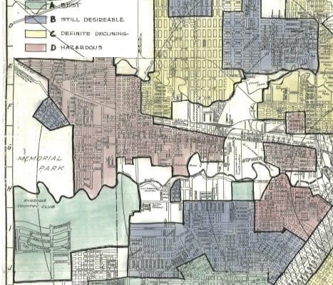
 Detail of map
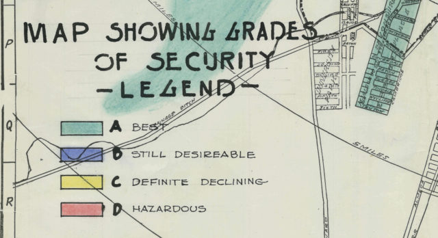
A great deal has been written about “redlining,” which was the practice of denying loans to certain areas of cities based, in part, on race. Not surprisingly, areas that were redlined declined, property values slumped, and for many, the only option was to move. The practice of redlining was institutionalized with the Home Owners’ Loan Corporation (HOLC) Residential Security Maps, though many scholars argue that the maps simply reflected the predominant lending practices of the time — and projected them into the future. Regardless, it is very clear that the maps tell us one part of the story of what went wrong, and how.
In the 1930s, sparked in part by the profound impact of the Great Depression --- on neighborhoods, homeowners, and homebuilding --- a series of government programs was established to re-start the housing industry and transform mortgage security and lending. As noted by Kenneth T. Jackson in his landmark book Crabgrass Frontier, residential construction between 1928 and 1933 plummeted by 95 percent; by 1933, half of all mortgages in the U.S. were in default. Because so many people were impacted, attitudes toward government intervention in the housing and lending industries changed substantially. One of the first agencies established was the HOLC, in 1933. The agency was charged with bailing out homeowners at risk of default on their mortgages, and, by 1936, more than one million loans had been issued.
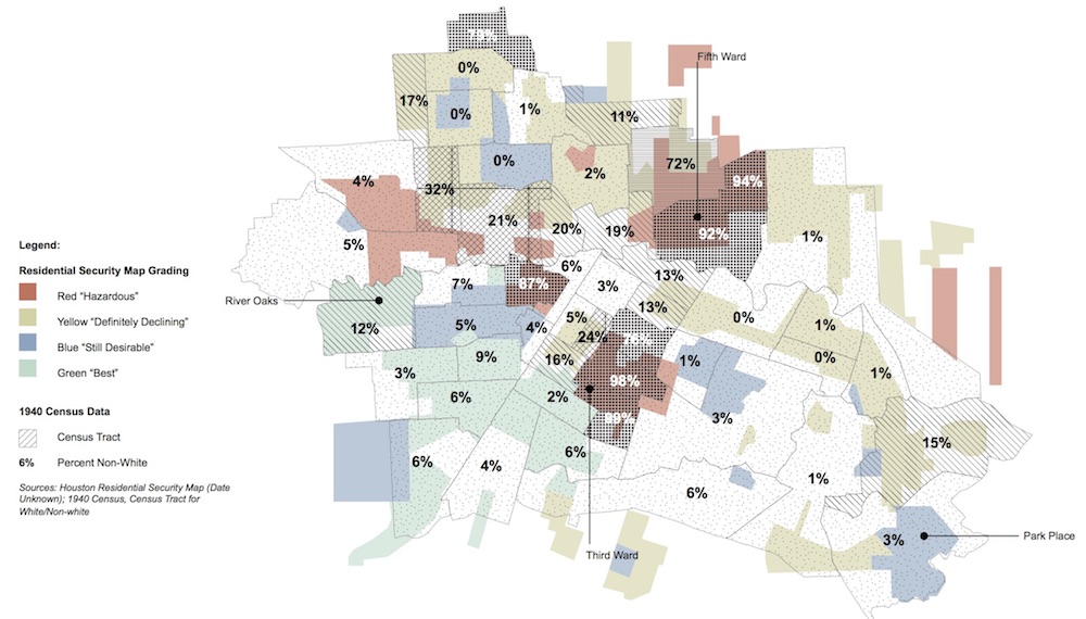 Redlining map layered with 1940s census data on race. Courtesy Susan Rogers.
The more infamous role of the HOLC, however, is as author of the Residential Security Maps. Amy E. Hillier (2005) notes that around 1935 the HOLC “embarked on the ambitious and secretive City Survey Program to investigate real conditions in cities across the country. This program resulted in a series of residential security maps for 239 cities that were designed to ‘graphically reflect the trend of desirability of neighborhoods from a residential viewpoint’ (Federal Home Loan Bank, 1937).”
The power of the maps was to make discriminatory practices visible and provide a verb for the practice of denying loans to certain areas of our cities --- an act we now know as “redlining.” Specifically, redlining refers to the grading system of the HOLC where “hazardous” areas were colored in red. There were three other grades highlighted on these maps: “definitely declining” in yellow; “still desirable” in blue; and “best” in green. The grades were established based on location, housing age and value, presence of incompatible uses, such as commercial or industrial --- and race. Hillier writes: “On the one hand, HOLC provided assistance to a million homeowners, across race and ethnicity, who were desperate to save their homes. On the other hand, [it] created security maps in which race was used to signify risk levels.”
 Federal Housing Authority Guide.
The HOLC is only one of the villains in this story; the discriminatory practices that were institutionalized after were far more destructive --- particularly those of private lenders and the Federal Housing Administration (FHA). Three important documents were created by the FHA: an Underwriting Manual, first published in 1935 and revised in following years that provided guidelines for lenders in appraising housing and neighborhoods; “Planning Profitable Neighborhoods” (1938), which provided guidelines for homebuilders and subdividers; and a report titled “The Structure and Growth of Residential Districts in American Cities” (1939) by Homer Hoyt, a primary advisor to the FHA.
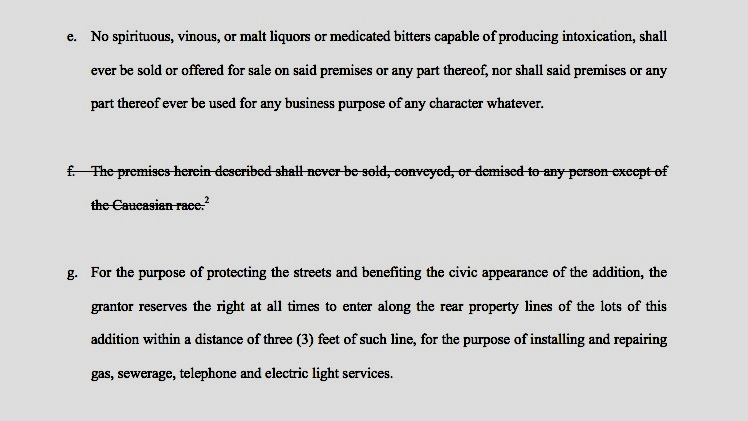
Combined, these documents privileged (and, in fact, institutionalized) lending for new housing outside of the central city, sparking suburban growth and “white flight” from the core. They also recommended that new subdivisions be protected from adverse influences through restrictive covenants. Adverse influences included nonconforming uses (read: mixed-use neighborhoods) and “inharmonious racial” groups. For example, the 1936 Underwriting Manual notes: “Deed restrictions are apt to prove more effective than a zoning ordinance in providing protection from adverse influences. Where the same deed restrictions apply over a broad area and where these restrictions relate to types of structures, use to which improvements may be put, and racial occupancy, a favorable condition is apt to exist” (Section 228).
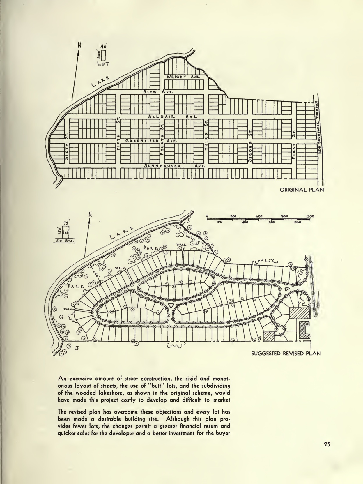
The “Planning Profitable Neighborhoods” bulletin describes and illustrates in a series of drawings “good” and “bad” development practices. Without fail, these drawings define the now-typical suburban models of discontinuous streets, large lots, and strip malls as “good” and traditional urban typologies as “bad." In effect, the combined policies and practices such as “redlining” ensured that central cities, mixed-use areas, and neighborhoods of color would decline.
In the Residential Security Map produced for Houston, the racism is clearly evident, as well as the privileging of neighborhoods farther from the central core. Houston was a fairly small city when this map was produced --- with just 300,000 residents in 1930 and climbing to nearly 400,000 by 1940. At this time, Houston was 77.5 percent white and 22.5 percent black. The tracts rated “hazardous,” without fail, reflected the concentration of black residents. For example, the majority (though not all) of the First Ward, Third Ward, Fourth Ward, Fifth Ward, and Sixth Ward were rated as “hazardous” or red. Other “hazardous” areas were Clinton Park and a neighborhood named “Brunsville” in the current Pleasantville area on the east side. This last neighborhood is for the most part gone, with Loop 610 and a number of railroads having diminished it to nearly nothing. Finally, “hazardous” areas also included portions of the Near Northside, Cottage Grove, and what used to be known as the “West End” along Washington Avenue. Areas rated “best” were all on the west side of Downtown and included Montrose, Southampton, and River Oaks, with “still desirable” ratings for Park Place, Eastwood, and Norhill.
 Deed restrictions for Mandell Place in Montrose, Houston. Source: mandellplace.org.
The true power of these maps is not in how they were used --- as other practices and maps that date both before and after the founding of the HOLC had far greater impact on institutionalizing discriminatory practices --- but rather how they tell the story of these practices. These maps are a visual record that projected a future of disinvestment and racism.
Such a historical record allows us to trace back the discriminatory practices that created the inequality we see in Houston today. Any observant person walking or driving across this city can still see patterns of segregation and disinvestment made so clear in the 1930s; however, the stark lines of the map are blurring with new construction transforming urban neighborhoods to accommodate those with the resources and desire to live close-in. The resulting demographic inversion leads to new questions.
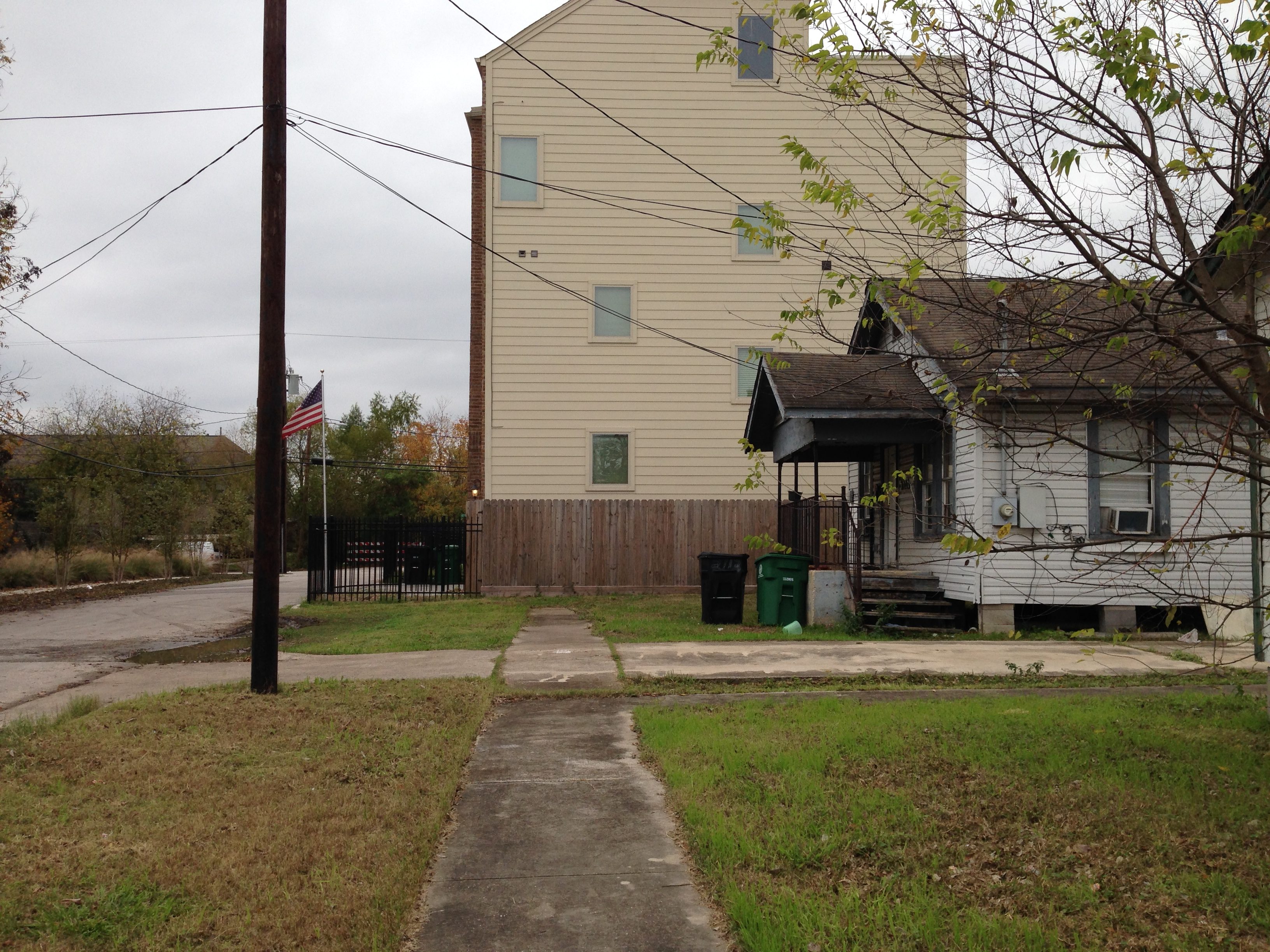 Townhouse construction that disrupts scale, context, and the public realm in the Third Ward. Photo: Susan Rogers.
Are we creating tools now that will lead to the same devastating disinvestment on the periphery where many, if not most, low-income people live? Can we create affordable housing options in neighborhoods like the Third Ward for those communities that persevered through an era of discrimination and disinvestment? And can we also provide affordable options for people who would choose to live in the neighborhoods that did benefit from decades of government-backed investment?
By Susan Rogers, Associate Professor and Director of the Community Design Resource Center at the University of Houston, Gerald D. Hines College of Architecture and Design. Visit the Texas Low-Income Housing Information Service for more information about housing equity.
Further Reading
Hillier, A. E.."Residential Security Maps and Neighborhood Appraisals: The Home Owners' Loan Corporation and the Case of Philadelphia." Social Science History 29.2 (2005): 207-233. Project MUSE. Web. 12 Apr. 2016. <https://muse.jhu.edu/>.
Jackson, Kenneth T. Crabgrass Frontier: The Suburbanization of the United States. New York: Oxford University Press, 1985. Print.
“Underwriting Manual: Valuation Procedure Under Title II of the National Housing Act." United States. Federal Housing Administration, 1936.
“Planning Profitable Neighborhoods Technical Bulletin No. 7." United States. Federal Housing Administration, 1938.