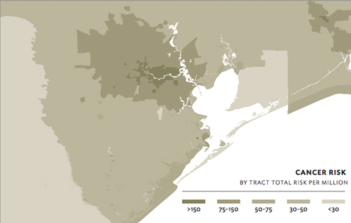

Houston total cancer risk per million by census tract as determined by the 2005 National-Scale Air Toxics Assessment (NATA). Source: epa.gov.
The above map shows cancer risk by census tract in the Houston region using data from the Environmental Protection Agency. We used the same data to emboss the cover of Cite 93. As in other cities, the areas closer to the center of Houston have a higher risk for cancer. However, one needs only to compare screenshots from the epa.gov mapping tool to see that Houston is exceptional. Let's look at Dallas-Fort Worth versus Houston.
The I-35 corridor from I-635 to downtown Dallas has a high cancer risk of 75-150 per million.

Dallas-Fort Worth cancer risk.

Houston cancer risk.

Houston 610 Loop-area cancer risk.

Detail of cancer risk along the Southwest Freeway.
Before looking at more data, let's ask what exactly "cancer risk" means. The data for these maps comes from the 2005 National-Scale Air Toxics Assessment (NATA), and you can read the glossary of terms here. In short, the numbers represent the risk beyond what a person not exposed to the measured toxins would have. This is the total risk for developing any type of cancer over a lifetime.
Back to our comparison: the area in Dallas is smaller than the area with the same risk in Houston.
Houston has a large area of cancer risk at the 75-150 per million range on the east side of town near the Ship Channel. That high-risk blob extends its tentacles along freeways to the west. Let's zoom in.
How do we interpret these maps? Why does Houston have such large areas of heightened cancer risk? You can learn more by reading Larry Soward's contribution to the current issue of Cite (93), "Growing Risks: Challenges to Maintaining Houston’s Prosperity and Air Quality." Though this map does not pinpoint specific causes, it does give an overall idea of risk. The presence of the industrial complex on the east side appears to have a major effect.
Should you specificially be worried? After all, "75-150 per million" comes out to a small fraction --- 0.00015 or about one out of every 7,000 people. Furthermore, according to Dr. Elena Craft of the Environmental Defense Fund, total cancer risk is associated with a wide range of factors including family history, socioeconomic status, lifestyle, age, and exposure to pollution. Nonetheless, any heightened risk is scary, and I want to know whether my young and economically comfortable friends on the east side are at a great risk of developing cancer specifically because of where they live. And there are other health problems caused by air toxins besides cancer. My concern for my friends on the east side is outweighed only by my concern for myself and my own family.
What many people I've spoken to about this map find striking are the tentacles of high risk that reach well into affluent southwest neighborhoods, including Southampton and Boulevard Oaks. The map above shows that the 75-150 per million range includes the area between the Southwest Freeway and Bissonnet. Think of the oak canopy along South Boulevard. Think Poe Elementary School. The high-risk area also includes the Museum District and Hermann Park. I lived just outside this area for 12 years. A large number of Rice Design Alliance members and Cite subscribers live in the general area as well. It appears we are all in this together, rich and poor, east and west.
More >>>
Read all online content relating to the Cite 93 special issue on the environment.