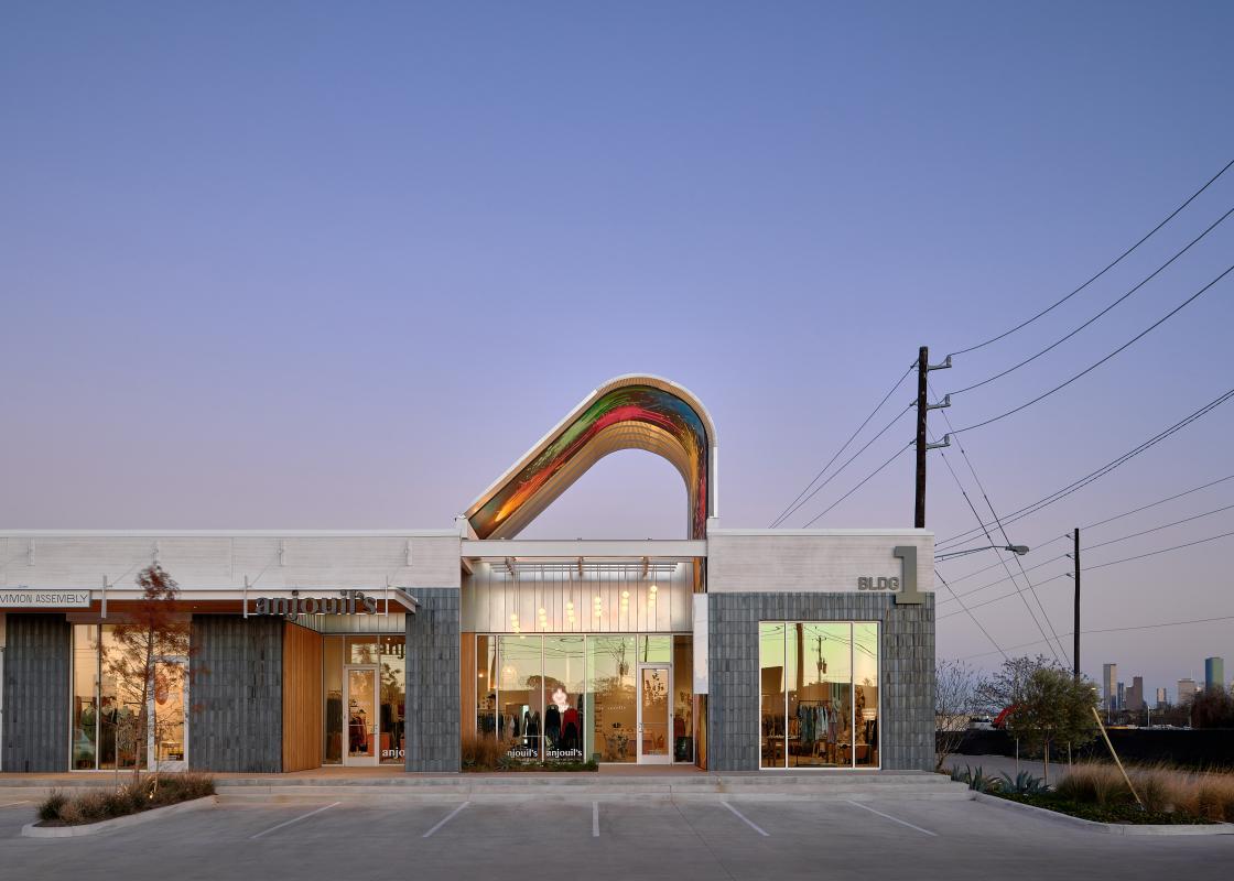
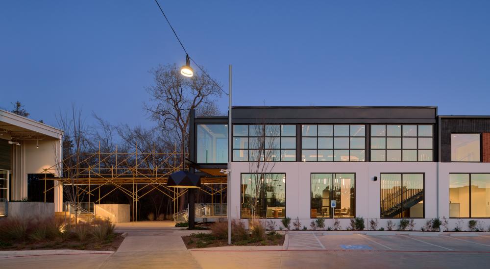
It’s difficult to pass M-K-T on Shepherd Drive without staring. Above the flat campus, steel structures painted in candy colors signal that something new is happening here—something intriguing. Developed by Radom Capital in partnership with Triten Real Estate Partners, M-K-T defies expectations about what’s possible when reusing old building shells. Early on, Steve Radom, Managing Principal of Radom Capital, knew he wanted to pursue the project through adaptive reuse—partly as a budgetary constraint and partly from a vision to embrace the authentic “Houston Heights attitude of the industrial site.”
After receiving mostly tabula rasa visions from potential design partners, Radom, a current member of RDA’s Board of Directors, commissioned Michael Hsu Office of Architecture (MHOA) to produce a concept design package. Radom knew they’d work well together, as they had previously completed projects like Heights Mercantile and 707 Yale together. In addition, MHOA has thoughtfully designed other adaptive projects in Texas, including Canopy Austin and Fareground at One Eleven (both are in Austin). For M-K-T, the office’s conceptual master plan solidified the architectural language found throughout the project. Method Architecture was brought on as the Architect of Record due to their warehouse and industrial experience, which was key to transforming the existing site conditions into the proposed design.
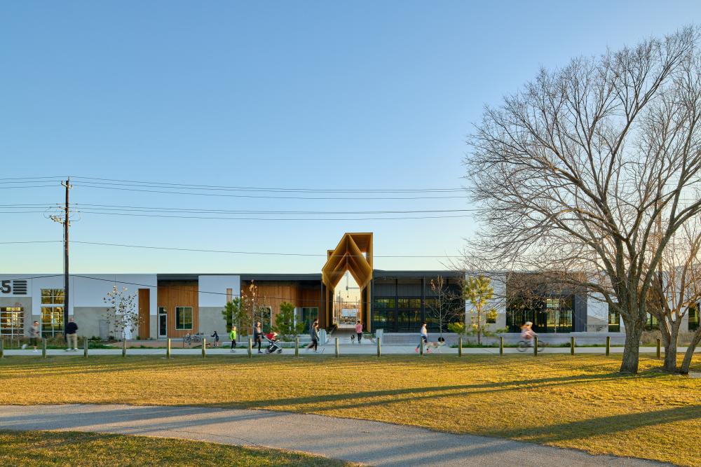
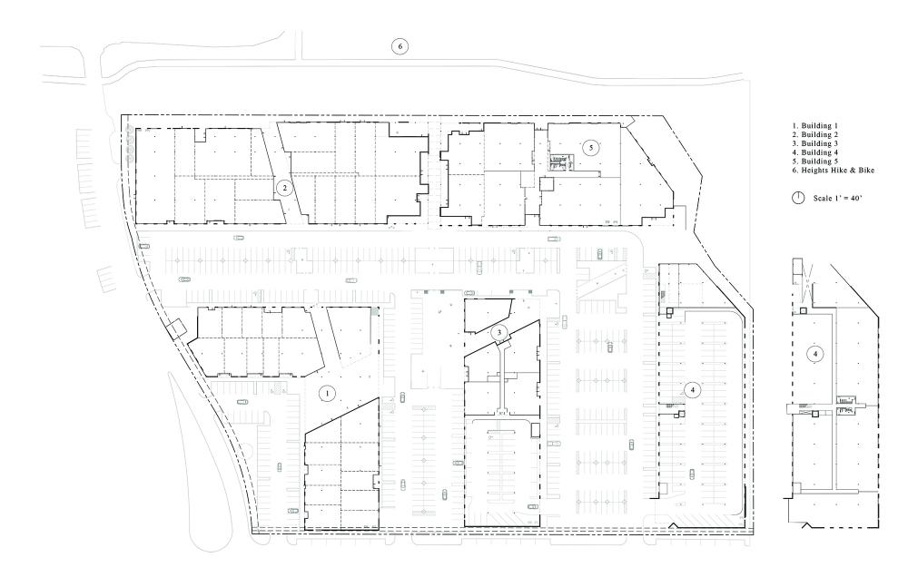
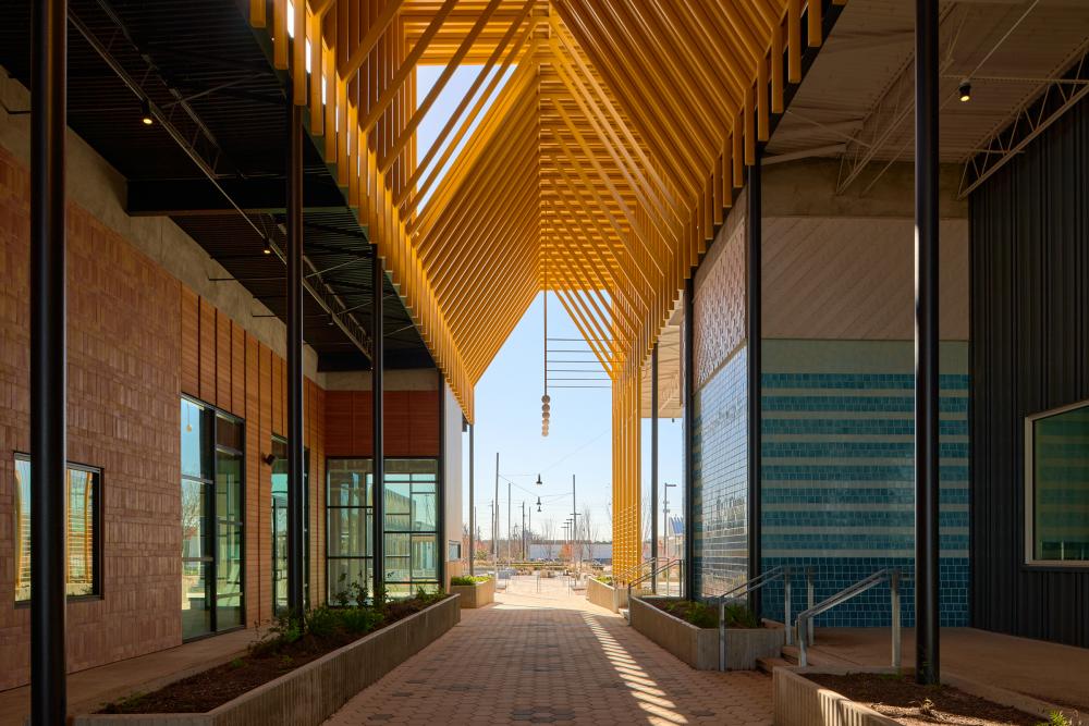
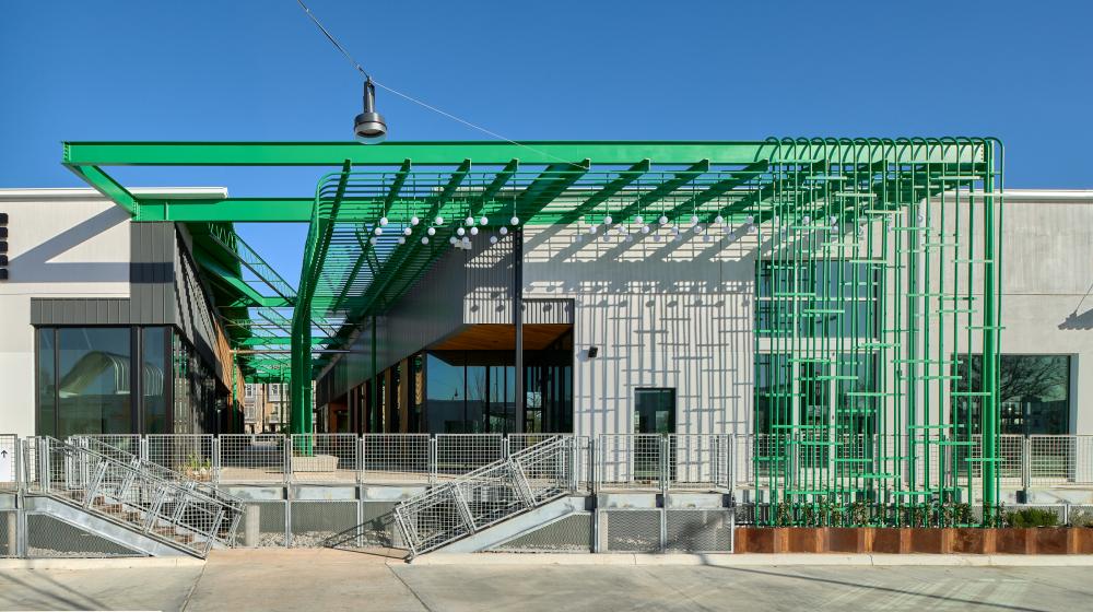
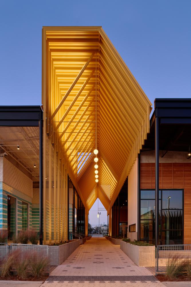
M-K-T is a complex of multiple buildings that required campus planning to achieve its desired effects. With multiple programs—including retail, office, and hospitality—intended to be laced together into a cohesive project, bold diagrammatic interventions directed the architectural approach. Due to the age and nature of the existing industrial buildings, nothing on site was precious. This gave MHOA the agency to subtract and add as needed to connect the spaces together. The unfriendly tilt-up buildings are converted into retail spaces by cutting ten-foot-wide promenades through the site, which visually connects the previously isolated buildings. Additions, including tall canopies and portals, are all constructed out of industrial materials. They feel monumental and engaging.
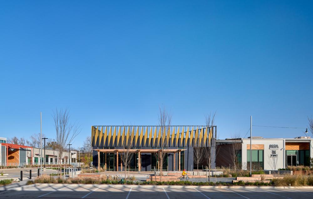
This layout is advantageous because it allows you to see any entrance as the front door depending on your mode of travel. It’s impossible to completely reject the car in Houston, but designers can loosen its grip on how spaces are organized. A converted parking zone and the exterior walkways is an inverted and amusing play on the former loading dock space, a flip which signals MHOA’s priorities onsite—people first, cars second.
Functionally, every space in the site feels connected to the next without the explicit need for signage. Instead, art pieces by local artists including Michael Rodriguez and Francesca Fuchs act as locating beacons for visitors within the site. Different programs are intelligently clustered across the buildings—restaurants near pedestrian and bike traffic, retail shops towards the street for those who can travel with their purchases. Wellness-oriented businesses are also located near the Heights Hike and Bike trail, offering an easy transition between activities.
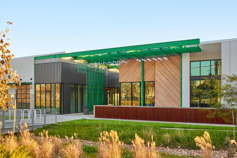
M-K-T can’t be summarized with a single architectural statement. The barrage of colors, materials, and textures can easily overwhelm the senses, and will get even busier once the tenant spaces fully open for business. Described by Michael Hsu, Principal of MHOA, as “architectural graffiti,” the site is loud and eclectic in every form. The approach could be dismissed as prizing over-the-top Instagram backgrounds, but Hsu’s team built a much more intriguing narrative into the wild nature of the project. It’s notable that this look is realized through architectural intent and not through the later imposition of some awkward PR campaign. The maximalism arrayed across the space is constructed mainly with cheap industrial materials or paint, all flattened like papiers collé on the façade. It’s intentionally chaotic at first, but the treatments gain clarity with longer and slower appreciations.
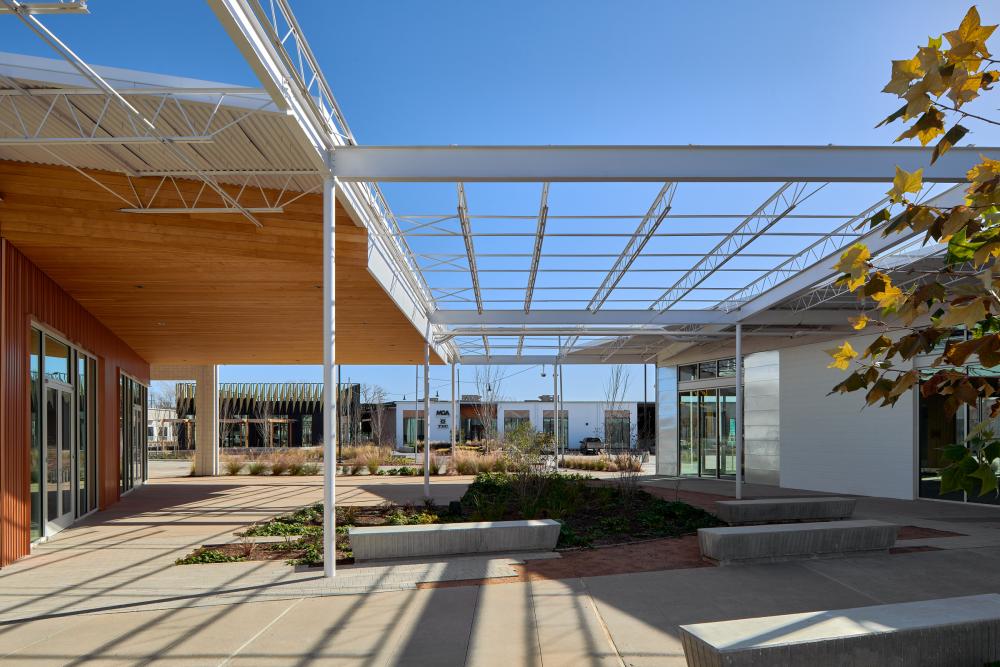
The color and punchy material palette counterbalances the anonymity of the existing tilt-wall buildings. The materials aren’t edited down; instead, there’s focus on the delicate balance of scale across the site. The “rhythm of motion” starts at the residential scale of the surrounding neighborhood. Each new material adapts to fit the speeds of different visitors as they pass by or through the campus—from the car, the bicycle, or on foot. The changing scale can be seen in the shift from the flat planes of painted concrete to densely tiled retail facades along the cut promenades. A subtle but texturally appreciated change is felt in the mixing of poured concrete hardscape with inlaid brick pavers in pedestrian-only zones. Throughout, the proportions of the industrial buildings set the baseline against which every intervention is compared.
The relationship between building and landscape doesn’t fall to the wayside at M-K-T. Leaning heavily on landscape architect SWA Group’s expertise, a parkscape weaves throughout the site, utilizing native plantings and turning required detention areas into beautiful features. The softer planting balances the boldness of MHOA’s interventions. Varied scales of park landscape play well with the architectural forms. For example: an enormous wavy bench parallel to the bike trail provides a playful object to rest on or clamber along; and central gardens connect the promenades at their vertices, reinforcing the connected nature of the site.
M-K-T opens its doors at an opportune time for this type of commercial venture. Outdoor, walkable retail is exactly what post-COVID shoppers are looking for after a long year of isolation. Perhaps the most telling sign of M-K-T’s future success is the number of visitors already strolling around the campus even when only a handful of storefronts are open. The sheer vibrancy of the space is enough to draw people from the road, bike trail, and beyond. Detractors may complain about the material intensity and wackiness of the project, but the eccentricity and ability to start conversations is what makes it so interesting. When more of M-K-T’s tenants open and crowds return, it’s hard to imagine the project won’t be one of the most successful Houston retail spaces in recent years.
Marcel Merwin is a practicing architect in Houston. He is Design Lead at Rootlab and Principal at studiomerwin. Merwin is pursuing his master’s degree at the Harvard Graduate School of Design in the Fall.


