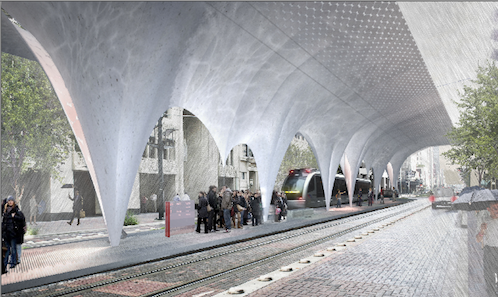
Rendering of proposed Central Station by Snøhetta
On the evening of Tuesday, January 24, the Houston Downtown Management District, along with Metro and its design-build component, Houston Rapid Transit, hosted a public presentation of five proposals for the new “Houston Central Station.” They were the result of an invited competition whose impressive advisory panel featured among others the new, and apparently well-connected, deans of Houston’s two schools of architecture, Patricia Oliver of University of Houston and Sarah Whiting of Rice University. Entries were presented by Chris Sharples of SHoP Architects, New York; Paul Lewis of Lewis.Tsurumaki.Lewis, New York; Neil Denari of Neil M. Denari Architects, Los Angeles; Mark Wamble of Interloop—Architecture, Houston; and Craig Dykers of Snøhetta, New York and Oslo. (I would have liked to see women architects like Jeanne Gang or Toshiko Mori also included.)
They are all decidedly avant-garde, modernist firms who have begun in the last several years to build increasingly large and prestigious projects. Collectively, they tend to use computer modeling to create rather complicated swooping and angled designs that rely on the newish technology of digitally assisted, custom fabrication for their realization. As such, they tend to be highly regarded in architectural schools and in the architectural press where these techniques are the common currency in trade, though perhaps somewhat less by the general public who usually seems to be either awed, mystified, or repulsed by such work.
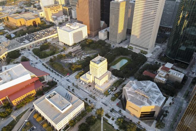
My initial fantasy image of fedora-clad Mad Men and buxom ladies in stiletto heels rushing to catch the midnight train in a moodily lit Central Station was quickly dispelled by the detailed introduction given by Lonnie Hoogeboom, Director of Planning, Design and Development for the Downtown District, who explained that, in fact, the project was for a modest open-air platform where two new light rail lines, the East End Line and the Southeast Line, intersect with the existing Main Street Line. The site is on Main Street between the existing Main Street Square Station and the Preston Station. It faces Houston’s great Art Deco setback skyscraper, the Gulf Building, completed in 1929, where the Sakowitz Brothers once had their department store. The Central Station will be inserted in the median between the existing tracks, and as a result, will only be about eleven-feet wide, but will run nearly the length of the block. The current budget is about $1 million, including design fees, and each firm was given a $20,000 honorarium for design and travel expenses. Once they accepted, they had about six weeks to design the projects they presented in Houston. That firms of such caliber enthusiastically participated in what is in reality a very small project is perhaps a signal of the clout of the advisory panel. The winning firm will subcontract to a local architect of record, selected by Metro, who will prepare the final construction documents.
Tuesday’s presentation was intended to gather public feedback, which will be given to the jury when they review the projects in the next few weeks. Just as impressive as the advisory panel is the list of jurors, which includes David Burney, FAIA, Commissioner, Department of Design and Construction, New York; Carlos Jimenez of Carlos Jimenez Studio, Houston; Michael Rock, Founding Partner & Creative Director, 2x4, New York; Carol Lewis, Director of Texas Southern University’s Center for Transportation, Training & Research, Houston; and Minnette Boesel, the Mayor’s Assistant for Cultural Affairs, Houston.
On to the projects.
The first to present was Chris Sharples of SHoP. He didn’t name it, so I’ll call it La Chimenea because of its three large chimneys that in theory will wick away hot, moist air from waiting passengers (and replace it with more hot, moist air?). It was to be a tensile structure, which in this case is translucent Kevlar membrane stretched over a rigid steel tube frame. La Chimenea has the benefit, in my opinion, of extending not only over the platform but over the power lines of the tracks, which would help with keeping driving rain off the passengers. Also, its lightweight construction seemed cost effective, and if the central supports were moved to the sidewalks on either side of the street, more space for better circulation on the narrow platform could easily be obtained. Finally, its multiple vertical shapes, which reminded me of something Frei Otto might have designed after he drank too much beer, would definitely stand out on the constricted site.

Rendering of Central Station proposal by ShoP Architects

Section of ShoP Architects proposal.

Rendering of Lewis.Tsurumaki.Lewis proposal.

Proposal by Neil Denari Architects

Detail from Denari Architects

Proposal by Interloop Architecture

Diagram of Snøhetta proposal

Aerial rendering of Snøhetta proposal
Project two was presented by Paul Lewis of Lewis.Tsurumaki.Lewis. It was basically a rectangular canopy raised over the platform that was torqued for added aesthetic value. The lifting of the edges of the box was intended to inflect towards the direction of oncoming light rail cars and to provide a place for signage to be installed. The structure was to be a series of steel tube columns about 12 inches in diameter spaced 18 feet apart. The canopy was to be made of a frame of six-inch square steel tubes. They were to be sheathed with plywood and stainless-steel panels on the outside in four different finishes and opal-colored, back-lit polycarbonate on the inside. Instead of a direct attachment between the columns and the canopy there was to be a web of two-inch-diameter steel tubes radiating from each column connected to the canopy, furthermore, directly above each column was to be a circular opening cut into the canopy. This column attachment and hole above troubled me, first because the hole seemed as if water during a rainstorm would hit the top of the column and splash about on people below, and second the web of little tubes seemed very tree-like and made me think of the grackle colony that has installed itself in the live oaks planted next to Metro’s Downtown Transit Center at Main and the Pierce Elevated (in the back where the busses go) and poop all over the sidewalk and on waiting passengers who don’t know to stay away.
Neil Denari presented the third project, and shame on me for not knowing he went to the University of Houston (B-Arch 1980), but I did very much enjoy the series of photos of iconic modern buildings in Houston (Astrodome, the Brown Pavilion of The Museum of Fine Arts, Pennzoil Place) that he took in the early 1980s. His project was based on lines—power lines, light rail lines, freeway lines, etc. The distinctive color of his proposal was taken from Alexander Calder’s red-painted metal crab in front of the Brown Pavilion as well as the Metro’s red coloring coding of the Main Street line on its maps. This project was to be fabricated out of steel (like the crab), fashioned into a continuous, sinuous, box-like strip that was about two-feet square with a flat rectangular canopy extending to the edges of the platform above. My one concern with this project was the thickness of the steel support and the fact that it was extended along a good portion of the platform. It seems like it might cause a bottleneck if there are a lot of people or someone in a wheelchair trying to get past.
Interloop’s project was called Open Transfer. And although I really liked the presentation renderings that used what appeared to be black and white photocopied images of the adjacent buildings collaged with a colored rendering of the station for a gritty late 1980s feel, there were so many cryptic explanatory diagrams that I have to admit I kind of got confused before partner Mark Wamble finished. From what I gathered, and from looking at their board that Metro helpfully posted on their website afterword, the gist of the project was that they wanted to use thrown-away traffic signs (the orange, yellow, and green ones, and a few of the white ones, but not the blue or brown ones, arranged in a gradation of tones) to clad the beefy steel-box truss that was going to support the canopy, which “communicates a poetic message about the utilization of refuse from the automobile culture to clad a mass-transit facility.” The underside was to be white-tinted cement plaster. At one end there would be a column in the center of the platform and at the other end, were outrigger-like supports resting on the sidewalks, that Wamble called the Spider, from which the canopy was suspended. The coloring was pretty cool, but I’m afraid in the end it will look messy with all those sharp edges, not to mention graffiti-like, perhaps something not to be encouraged in Metro’s premier light rail station.
The last project, and my personal favorite, was Snøhetta’s, presented by Craig Dykers. Dykers explained that the four times he came to Houston to meet and look at the site, it rained, pretty hard apparently. He continued that locals use the term “cow pissing on a flat rock” to describe these wet weather events, which got the biggest laugh of the night. And while I don’t believe I’ve actually heard such a term uttered in the 15 or so years I’ve lived here, I’m definitely going to try to start using it more frequently once the drought ends. Their project called for a concrete canopy whose stalactite-like shapes were derived from the image of stop-action photographs of water droplets and the cast-in-place, folded plate concrete structures designed by Felix Candela in the 1950s and 1960s. However, this being the 2010s, the forms were going to be computer milled, hollow Styrofoam with a variety of ridges, squiggles, and holes programmed in. These were all intended to catch and channel rain water for the visual delight of passengers trapped on the platform during a storm. One very un-Candela like detail, to me at least, was that the canopy required a series of guy wires to stabilize it in high winds. Hopefully something could be worked out to get rid of them. I thought there was a wonderful symmetry between the first and the last projects. Both were concerned about heat and rain, two of Houston’s most important weather considerations. The first sought to push heat out the top with chimneys and the last sought to suck rain in with funnels. Maybe a whole series of stations could be designed to reference Houston’s climate in witty ways as these two do, which in the absence of topography or other attractive geological attributes takes on such a huge role in defining the characteristics of the city as a distinct place.


