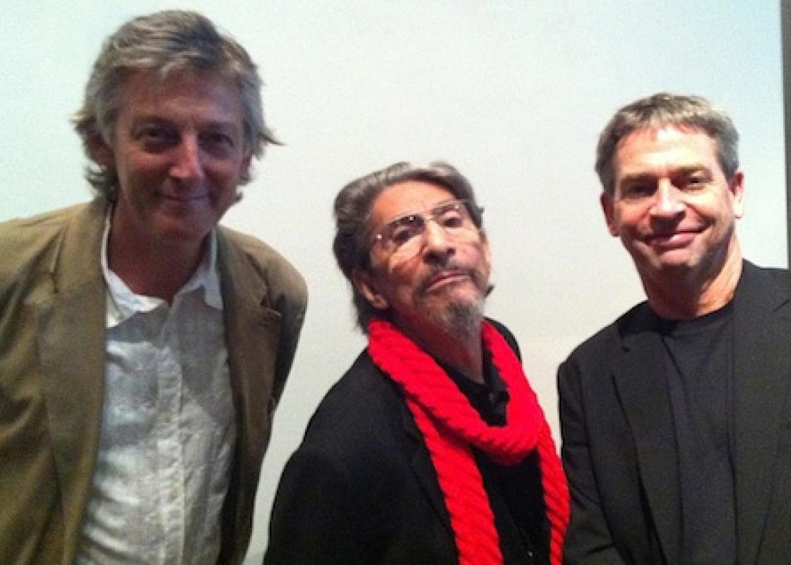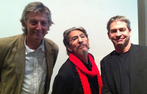
Fernando Brave, Pablo Ferro, and Craig Minor
Apparently, a whole army of people in Houston know who Pablo Ferro is and love his work. The Museum of Fine Arts, Houston event (co-sponsored by the Rice Design Alliance and AIGA) was packed for the sold-out presentation of the title designer, movie director, animator and all around Renaissance Man. The crowd was a heady mix befitting of the presenter himself: a slew of hipsterfied young graphic designer nerds mixed with older film buffs, advertising professionals, architects, and typography geeks. The eclectic audience was an indication that Pablo Ferro has been fully rediscovered (if he was ever really forgotten).
Love of Pablo Ferro, the cult figure, has been growing for some time now. The rebirth of interest in him has been driven by a large, impressive and always surprising body of work (and its recent appearance in easily searchable YouTube videos): the skinny, sexy film titles of Dr. Strangelove, the boxy split screens of The Thomas Crown Affair, the flipped Я of The Russians are Coming, and the quick-cut, psychedelic weirdness of the Clockwork Orange trailer. Ferro created an aesthetic for an era and laid out an array of visual techniques that would be copied and reworked for decades. In recent years, he's received a series of well-deserved awards from prestigious organizations, including the Smithsonian Cooper-Hewitt Design Museum. There's also a documentary film in the works that combines animated sequences with celebrity interviews (e.g. Anjelica Houston and Jeff Bridges) to tell the story of Pablo's unconventional life: his road from Cuba to working with Stan Lee and Disney in New York to Hollywood studio work and finally to a humble garage in L.A. where he lives and works to this day.
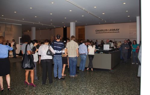
Line at the Pablo Ferro talk
In his appearance at the MFAH, Ferro alternated between telling funny anecdotes, talking about his creative production processes, and reminiscing about his adventures with the likes of Stanley Kubrick and Hal Ashby and even Michael Jackson in his video for Beat It. A font of advice, jokes, and clever turns of phrase, Pablo Ferro was imminently charming. While on stage, he (and later his loquacious son) showed a variety of short videos of his work, displaying the graphically complex visuals and typographic high-wire act for which he's best known. It was a casual tour through an incredibly full career. One story he didn't tell at the MFAH is why he wears his iconic red scarf. In an interview, one of the directors of the upcoming documentary on Ferro, Richard Goldgewicht, tells the story:
[O]ne day, [...] a hit man shows up and BANG!: shoots Pablo straight up, pointblank. Pablo closes the metal door of the loft and half of the bullet splinters off, ricochets in three different walls and hits him in the neck. The loving-hippie, the ringleader, the good guy comes crashing down, and somehow, miraculously survives after a series of operations. When Pablo wakes up from the nightmare, he can’t at all explain what happened — it could have been a hit man sent to the wrong door, the drug-lab upstairs perhaps, or “just another New York story."
And so, the red scarf becomes armor and a witty come-back to a hostile world, an entirely Ferrian response to tragedy: allowing problems to drive the creative process. Ferro is a startling mash-up of contradictions and ironies: an ardent experimentalist best known for his commercial work for advertising companies and movie studios, a dyslexic title designer who can't spell, a Cuban immigrant who came to define the aesthetic feel of sixties U.S. visual culture. And it seems we're just beginning to appreciate him.


